Concept · Branding and website
Harbour & Oak: Cafe Brand and Website Concept
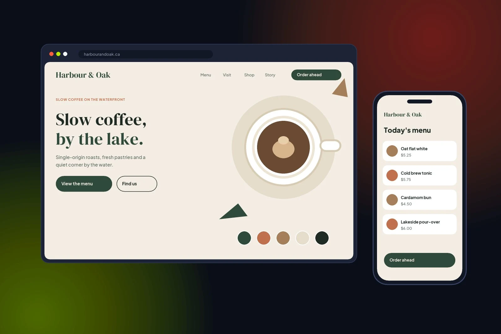
A brand identity and mobile-first website concept for a fictional Toronto waterfront cafe, designed around a calm, warm and local feel.
Project overview
Harbour & Oak is a concept brand and website we created for an imagined independent cafe on the Toronto waterfront. The goal was to show how a small hospitality business can look premium, feel local and make ordering ahead effortless on a phone.
The brief we set ourselves
Create an identity that feels slow, warm and natural, then design a website where the menu, location and “Order ahead” are never more than one tap away.
Concept project: self-initiated work for a fictional brand, created to show our design and development approach. It is not client work.
At a glance
- Type
- Concept project
- Services
- Brand identity, web design
- Deliverables
- Logo, palette, typography, website and mobile menu
- Palette
- Forest green, terracotta, oak, cream
What we designed
The core pieces of the concept.
Wordmark and typography
An elegant serif wordmark paired with a clean sans-serif for menus and UI.
Colour palette
Forest green, terracotta, oak and cream inspired by the lake and natural materials.
Website homepage
A calm hero, clear menu and visit links, and a prominent order-ahead button.
Mobile menu
A thumb-friendly menu with prices and quick ordering.
Local SEO structure
Location, hours and menu content structured for Google and AI search.
Brand applications
Cups, signage and social templates using the same system.
Our approach
How we developed the concept.
Mood
Defined the tone: slow, warm, natural, local.
Identity
Designed the wordmark, palette and type system.
Interface
Designed the website and mobile menu.
System
Applied the brand across touchpoints.
Design decisions
- Serif wordmark for a crafted, independent feel.
- Order ahead placed in the header and on mobile.
- High-contrast text on cream backgrounds for readability.
- Menu as real text, not images, so search engines and AI can read it.
Services used
The Angeles Marketing services behind this project.
Tools
- Brand identity
- UI design
- WordPress
- Local SEO
Want a brand like this for your business?
Call +1 647-739-1798 or email info@angelesmarketing.ca.